Think technical analysis is too complex Think again! Our blog on stock market analysis for beginners makes it simple and practical.
Starting investing in the stock market can feel confusing at first, so many numbers, charts, and terms that seem hard to follow. But once you learn the basics, it makes a lot more sense. In fact, more and more people in India are now trying out stock investing. As of 2025, there are over 15 crore (150 million) demat accounts, showing just how many beginners are entering the market.
That’s why learning stock market analysis for beginners is so important. Knowing how to read charts and spot simple patterns can help you make better decisions and avoid common mistakes. In this blog, we will discuss the essentials in a clear and simple way, perfect for anyone new to the market.
What is Technical Analysis?
Technical analysis focuses on forecasting stock price behavior by examining historical trading data such as price trends and trade volumes.It relies on the belief that past trading behavior often repeats over time. For those just getting started, this means understanding how to read price charts, recognize movement patterns (rising, falling, or flat), and identify important zones like support (where falling prices often pause) and resistance (where rising prices tend to stall). Indicators like moving averages are useful in minimizing daily price noise, offering a clearer view of broader market direction. While not foolproof, technical analysis helps make better trading decisions.
Basics of Reading Stock Charts
Understanding stock charts is an important stepping stone of beginner technical analysis, allowing you to identify price trends, patterns, and potential market movements. Although various chart types exist, the most common for beginners are line, bar, and candlestick charts.
Types of Charts
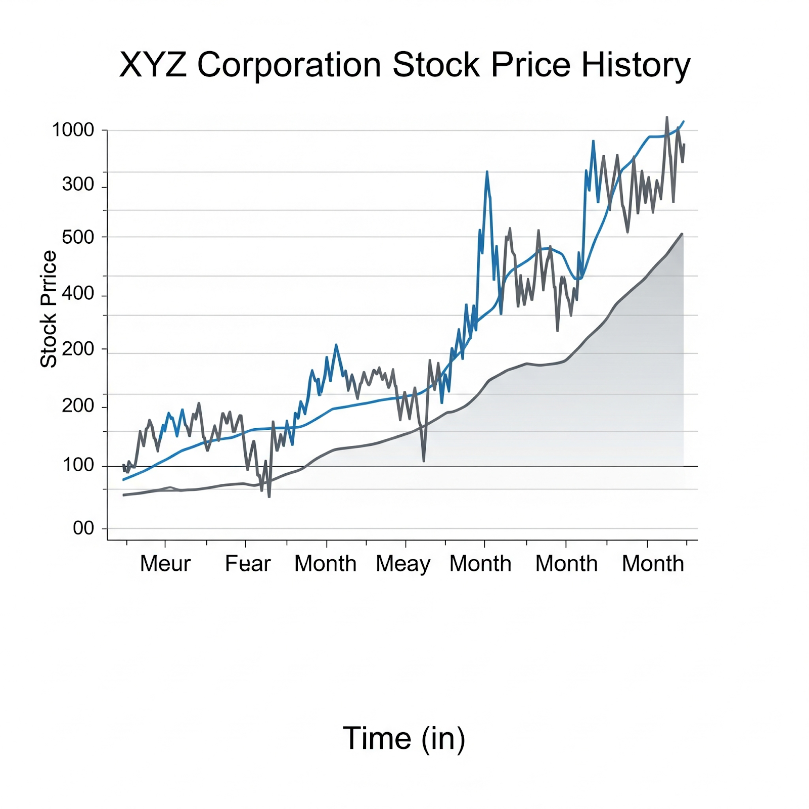
- Line Charts
These are basic tools that track average closing prices across a set timeframe to help identify smoother trends. They offer a clear overview of the general price trend of a stock. Shown below is a clear example of a line chart.
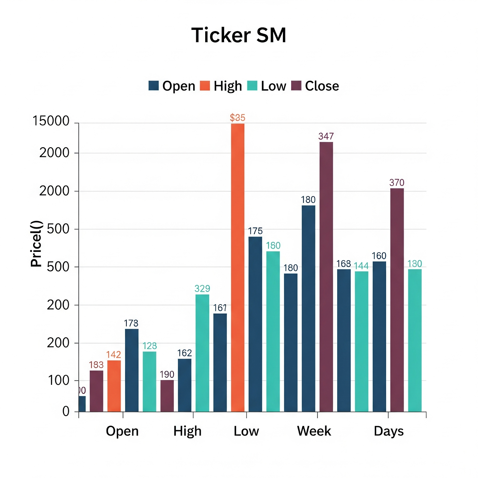
- Bar Charts
Also called OHLC charts, bar charts visualize trading activity over specific intervals such as daily or weekly by showing key price points. On these charts, the top of the vertical bar marks the day’s peak price, the bottom marks the lowest, with left and right dashes showing the open and close, respectively. An example of a bar chart is shown below.
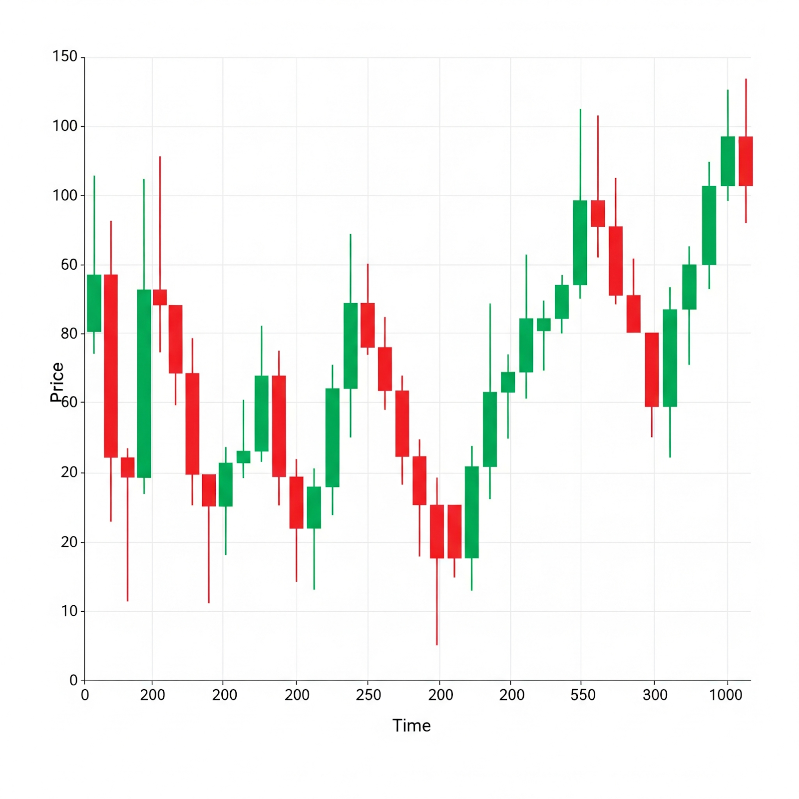
- Candlestick Charts
These are widely preferred by traders for their rich visual information. Like bar charts, candlestick charts display price action for a set period, but their colored “bodies” make it easier to spot bullish or bearish behavior at a glance. Wicks represent price extremes within the timeframe. Widely used for pattern analysis, they help traders make informed decisions. Refer to the candlestick chart shown below for better understanding.
Key chart elements include:
- Open (O): This is the first value at which a stock is traded when the market session begins.
- High (H): The maximum price reached during the time window.
- Low (L): The minimum price seen during the same period.
- Close (C): The final trading price for that interval.
- Volume: The total number of shares exchanged; higher volume often signals stronger market interest or pressure.
Reading Candlestick Patterns and Chart Formations
Once you’re comfortable with candlestick charts, the next step is learning to read common patterns and formations. They act like visual cues, showing shifts in buying or selling pressure that could affect future price movement.
Candlestick charts display four key price points: open, high, low, and close, within a specific time frame. Certain patterns formed by one or more candles often signal a change in momentum.
Single Candlestick Patterns

These are formed by just one candle and can signal key turning points.
- Hammer: This is a single-candle bullish reversal signal that appears after a downtrend. It features a small real body with a long lower shadow, showing that buyers stepped in after sellers initially drove the price down.
- Shooting Star: On the other hand, a Shooting Star appears after an uptrend, signaling potential reversal as it shows failed buying strength followed by selling control.
Multiple Candlestick Patterns
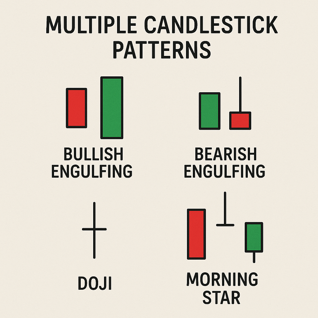
Formed using two or more candles, these offer stronger signals.
- Bullish/Bearish Engulfing: A large candle fully engulfs a smaller one. Bullish appears after a downtrend, signaling a reversal; bearish appears after an uptrend.
- Doji: Formed when the open and close are nearly equal, signaling market indecision, especially after a strong trend.
- Morning Star: A three-candle bullish reversal pattern that reflects a shift from selling pressure to buying momentum.
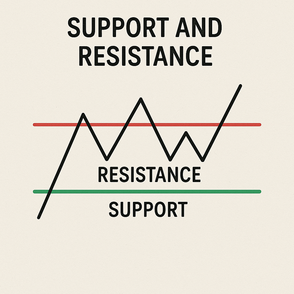
Apart from single candlestick patterns, traders also look at support and resistance levels, these are price points where the market often stops or changes direction. Support is like a floor that holds the price from falling, as buyers step in. Resistance is like a ceiling that blocks the price from rising, as sellers take control. Knowing these levels helps traders guess where the price might bounce or break through.
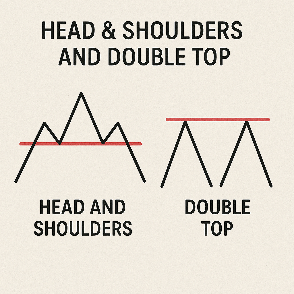
Traders also use bigger chart patterns like Head & Shoulders and Double Top or Bottom to understand the overall trend. These patterns usually appear before a big change in price direction and can help predict if the market is about to reverse.
Using Indicators and Oscillators for Stock Prediction
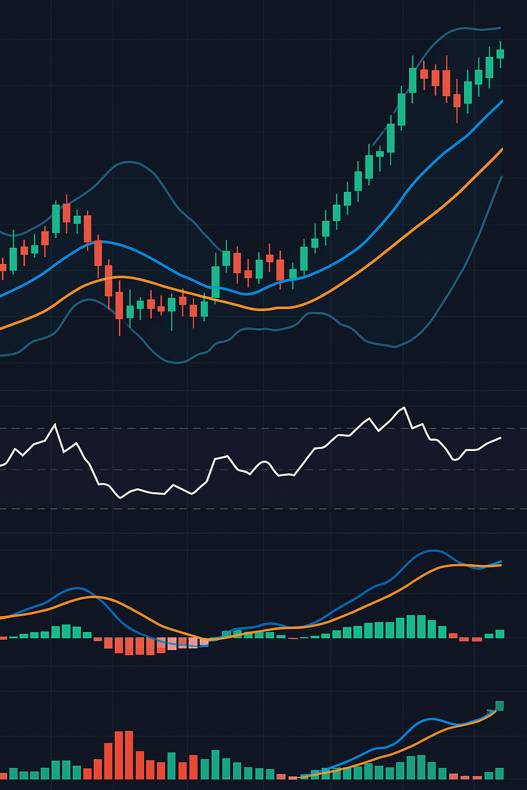
In stock market analysis for beginners, indicators and oscillators are powerful tools that help make sense of price movements. While price charts and patterns show what’s happening visually, these tools add a layer of analysis using formulas based on price and volume.
Moving Averages
A Moving Average (MA) shows the average price over a period, reducing short-term noise and revealing the broader trend.
- A Simple Moving Average (SMA) gives the mean of closing prices over a chosen time span (like 50 days), useful for identifying broader trends.
- The Exponential Moving Average (EMA) puts more emphasis on recent prices, making it better for spotting short-term shifts in price direction.
Rising MAs signal an uptrend, whereas falling MAs suggest a downtrend. A popular strategy is the moving average crossover. A bullish crossover happens when a short-term average climbs above a long-term one, signaling a potential buying opportunity. A bearish crossover happens when it dips below, hinting at a sell signal. When it crosses below, it gives a bearish (sell) signal.
Oscillators
Oscillators are indicators that swing within a range, signaling when a stock may be overbought or oversold.
- RSI (Relative Strength Index) ranges from 0 to 100. Over 70 signals “overbought,” under 30 means “oversold.”
- MACD (Moving Average Convergence Divergence) uses two lines and a histogram to spot momentum shifts and trend reversals.
- Bollinger Bands combine a moving average with two bands that expand and contract based on market volatility. Prices near the upper band may face resistance, while those near the lower band may find support.
No single indicator is perfect. By combining moving averages, RSI, and chart patterns, traders can confirm signals and make smarter decisions.For example, if RSI is oversold and a bullish crossover appears, the buy signal is more reliable, increasing confidence in your market analysis.
Conclusion
Stock market analysis for beginners turns complex charts into clear signals and beginners into confident traders. With candlestick patterns, trendlines, and smart tools, predicting market moves becomes simpler. To sharpen your

- Forex Trading for Beginners: Strategies, Risks & Profits - April 7, 2026
- Make in India 2.0: How Manufacturing Is Reshaping Market Sentiment - December 13, 2025
- Real Estate Boom : Why Tier-2 Cities Are Attracting Big Investors - December 12, 2025